"WASTED" was a project made to showcase the culture that surrounds the solo cups. They are associated with alcohol and plastic waste that can be seen after a party. This was mainly created for fun but every story has to have some kind of moral or lesson to learn so I'll say that we should make better choices in the long run or we all suffer.

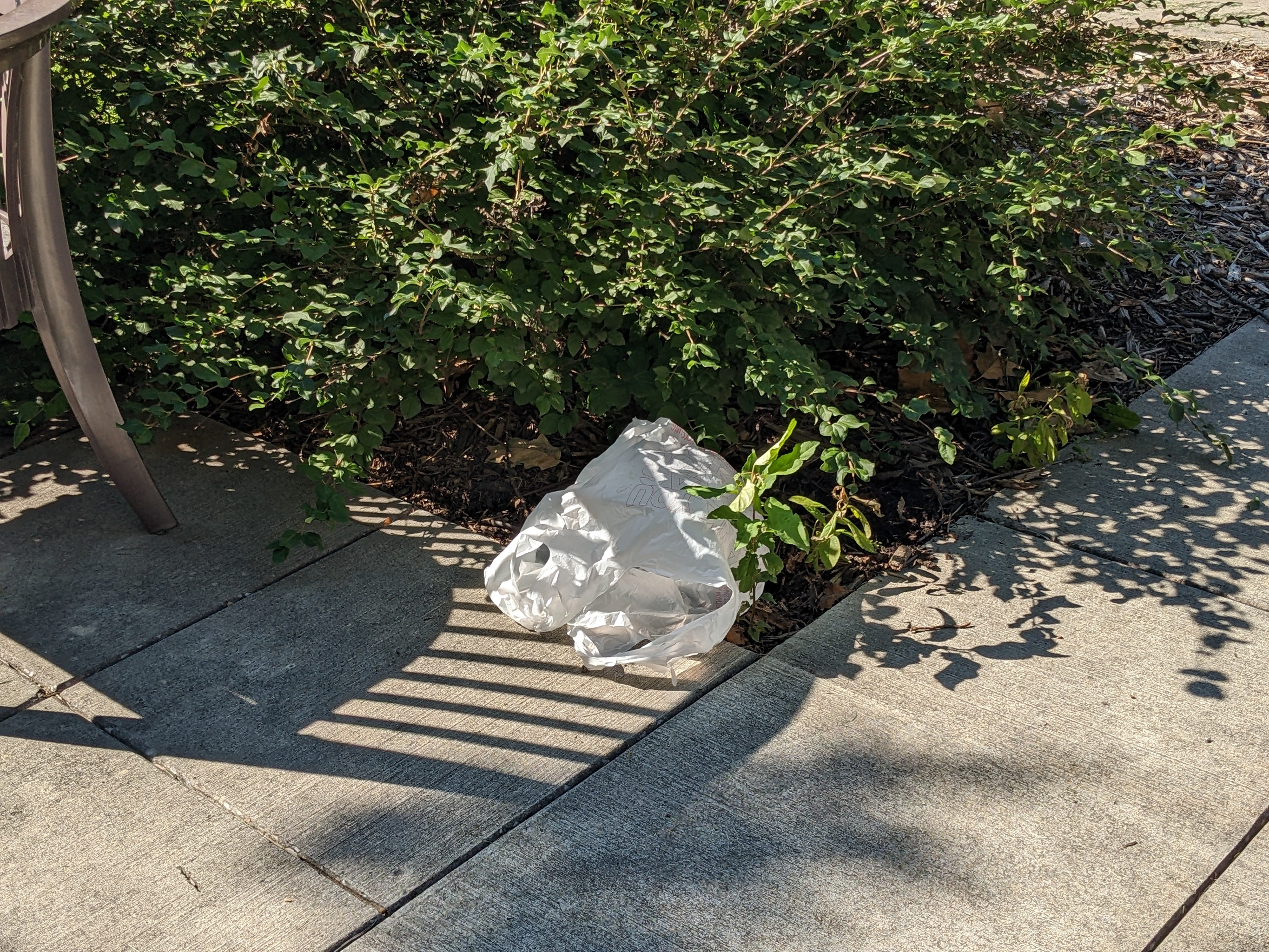
The goal of this project was to create typography in 3-D an apply it to the real world in some way, shape, or form. After I wander around looking for ideal places to place types, I noticed various garbage scattered around and figured that I would lean towards making something out of common litter. In the end, red solo cups were the chosen material for the making.
INSPIRATION
Hologram Shadow by Milton Glaser
This would become a catalyst of sorts for how I would plan out and create letters out of Solo cups. This font, called Hologram Shadow, used cones and cylinders as the basis for the letters to take shape.
SKETCHING
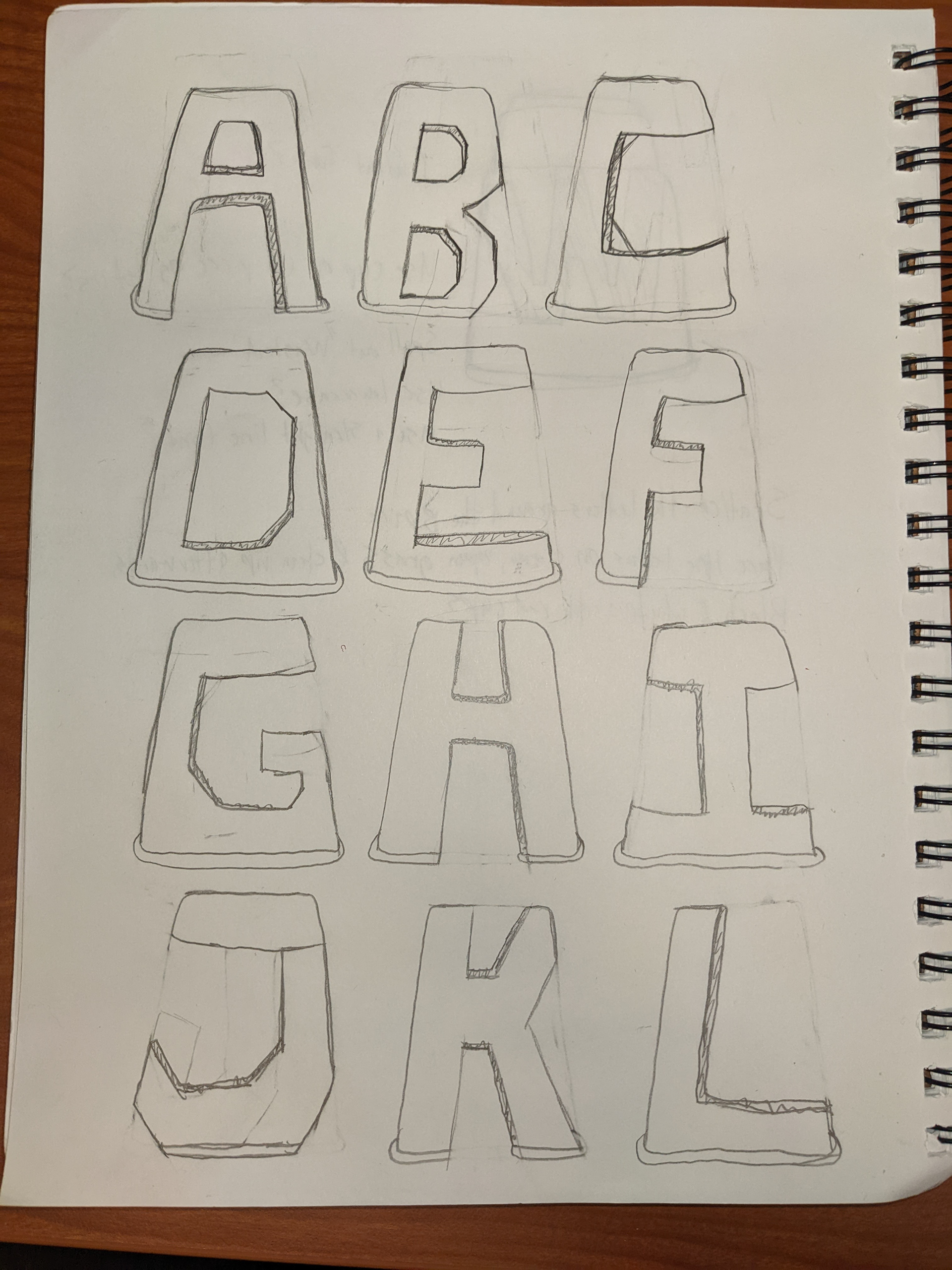
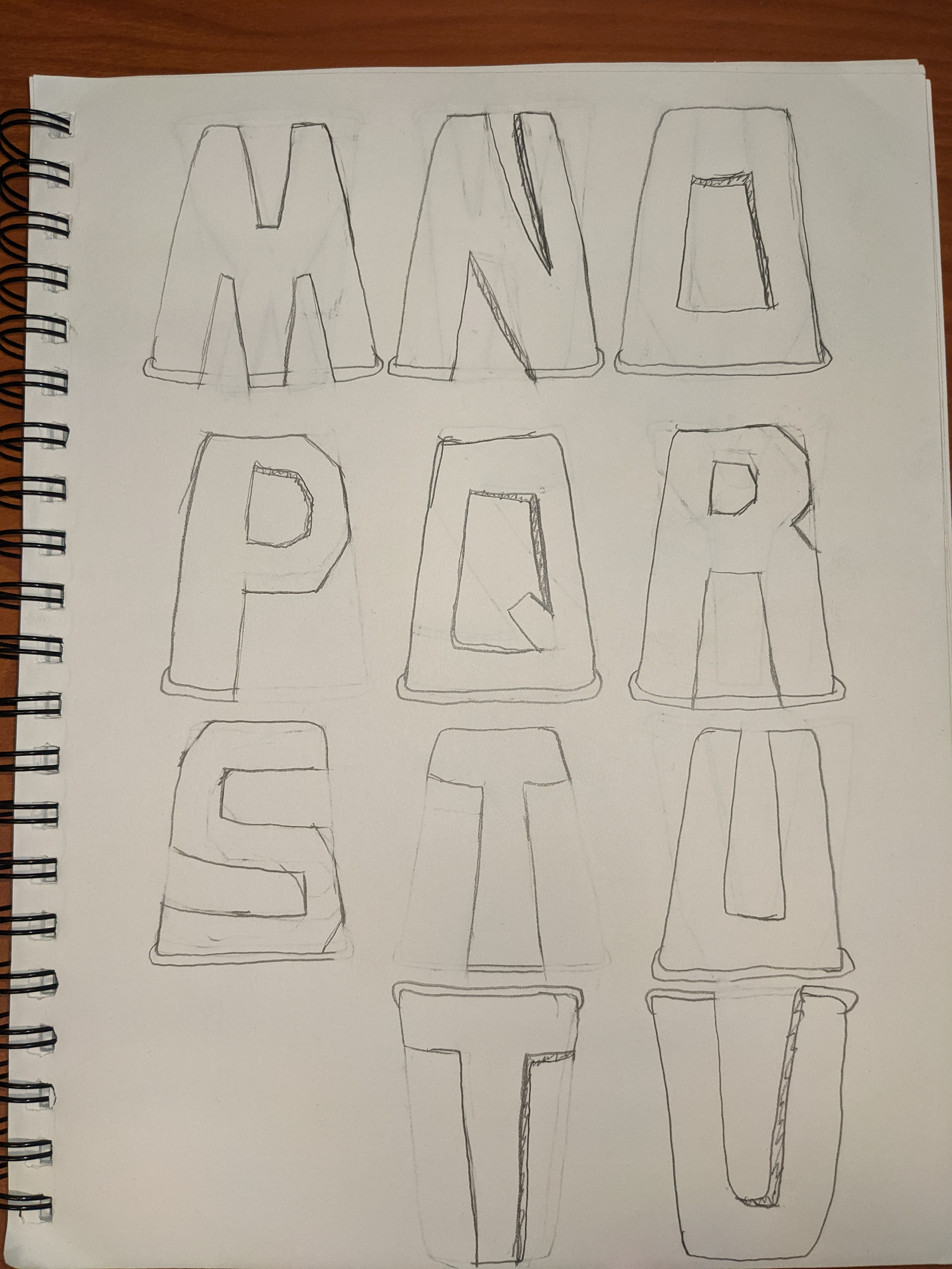
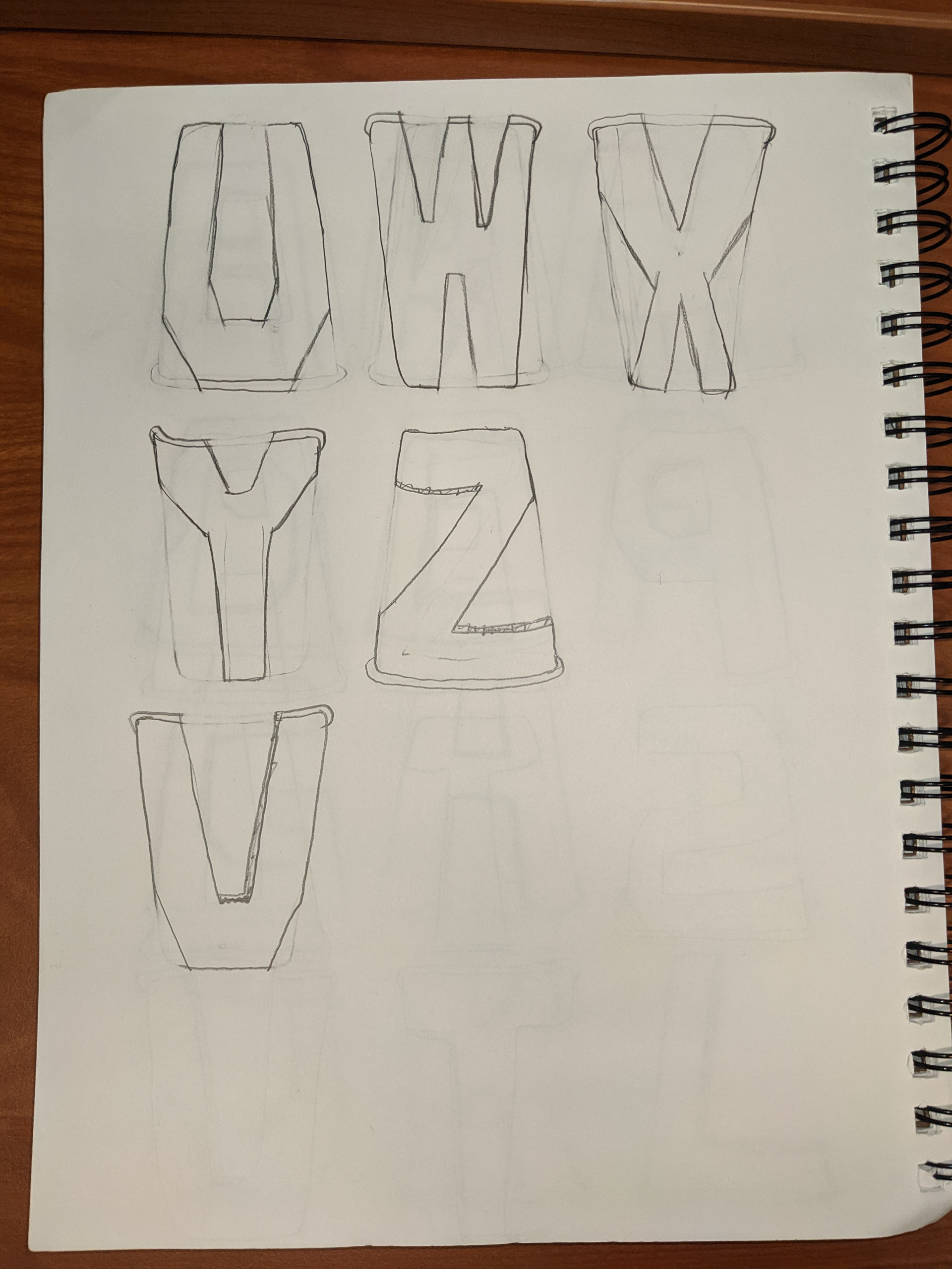
After I found inspiration, I went to work on sketching the whole alphabet and fitting them into the shape of a Solo cup. Most letters were pretty easy to adapt while others were a bit more challenging like the letters "R", "W", and "X". These sketches also show that the cups would be cut out with open holes on both the front and back sides, but it would end up just being the front side with open holes.
EARLY WORKS

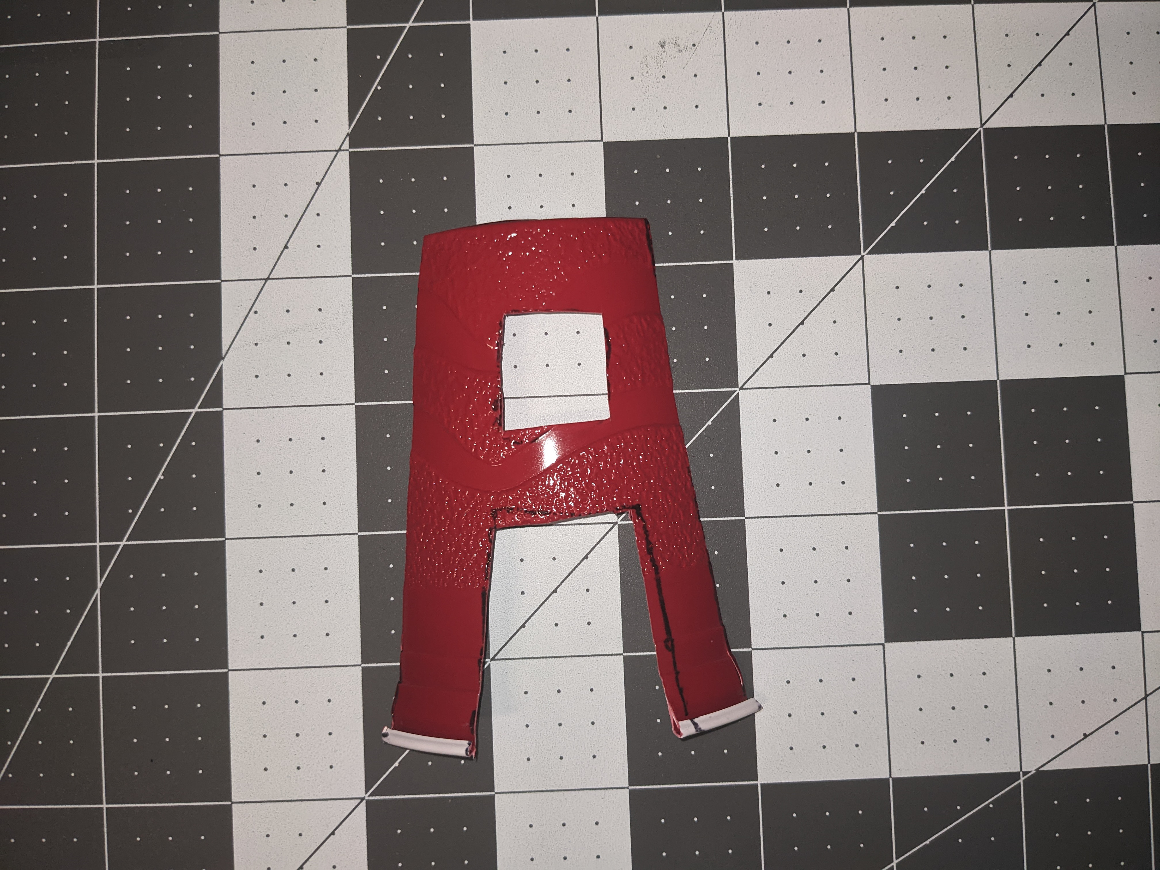
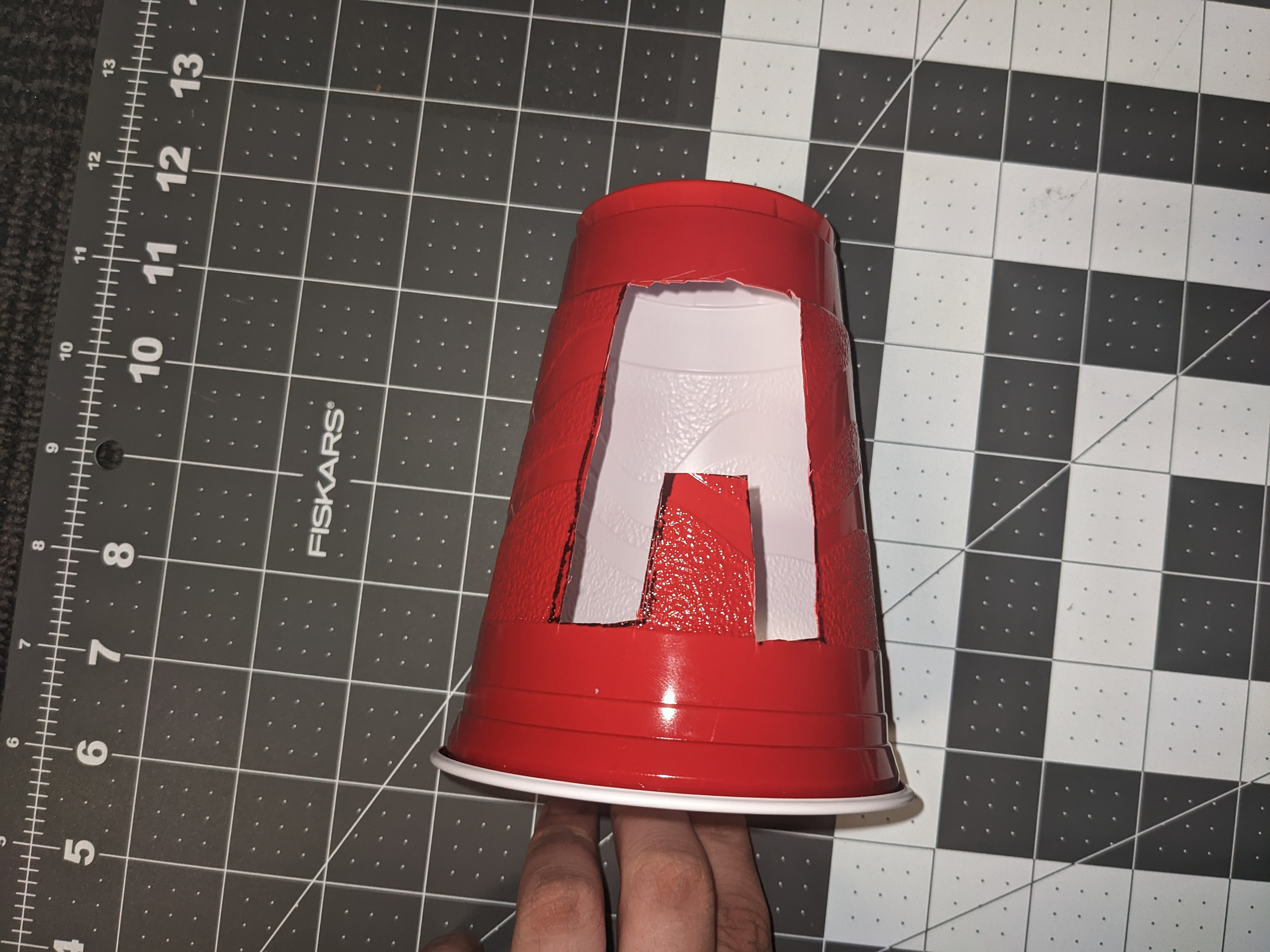

As the title suggests, these are photos of my first attempt at creating letterforms from the Solo cups. Originally, I was thinking of making letters from the material itself before realizing that it would be too simple and wouldn't really work with what I had planned. I also thought of doing a cutout font on the cups themselves. While that idea may have worked, I went with molding the cups into full-sized letterforms as I felt they were the best result going forward.
PROCESS/PROTOTYPES
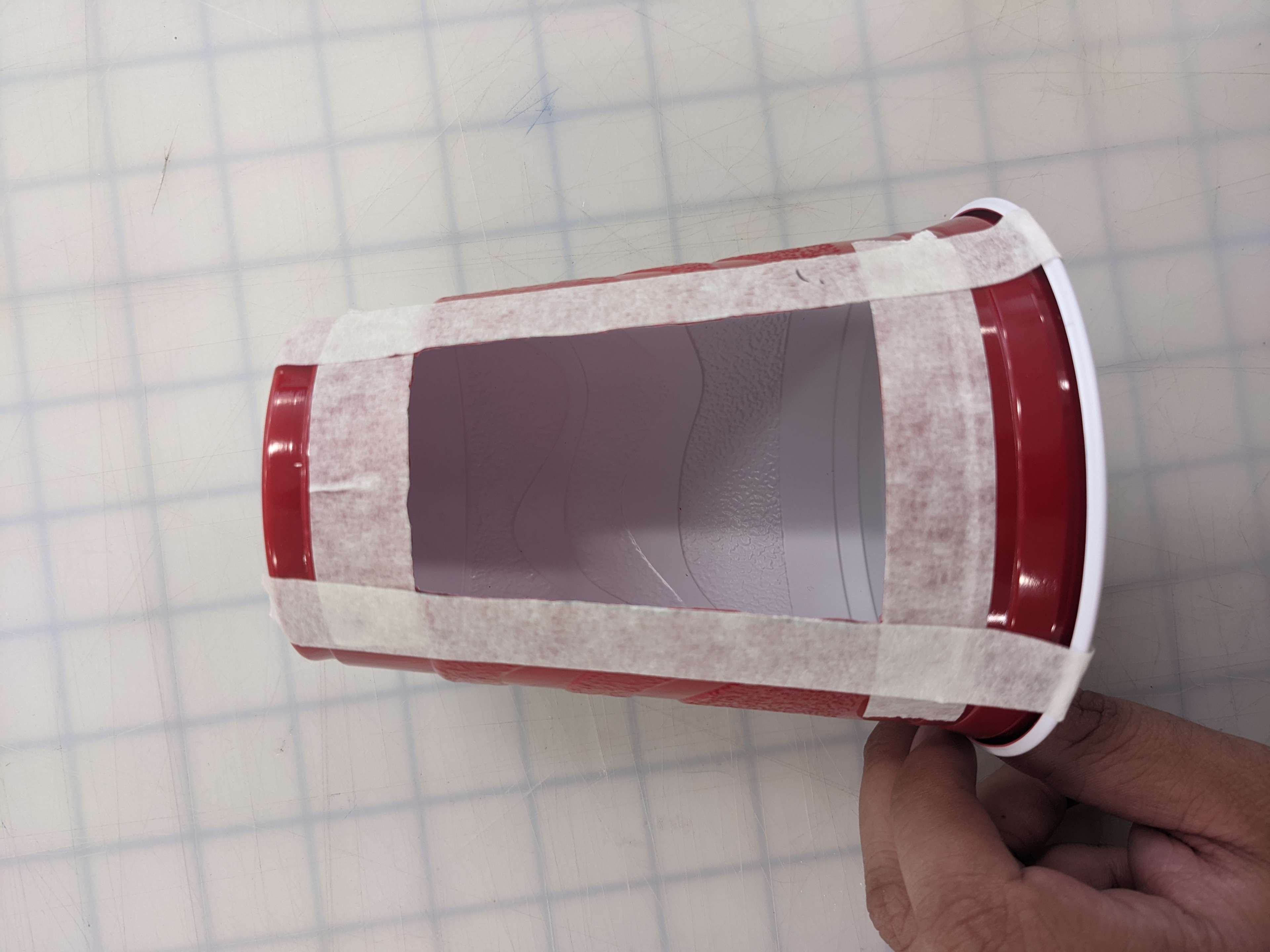
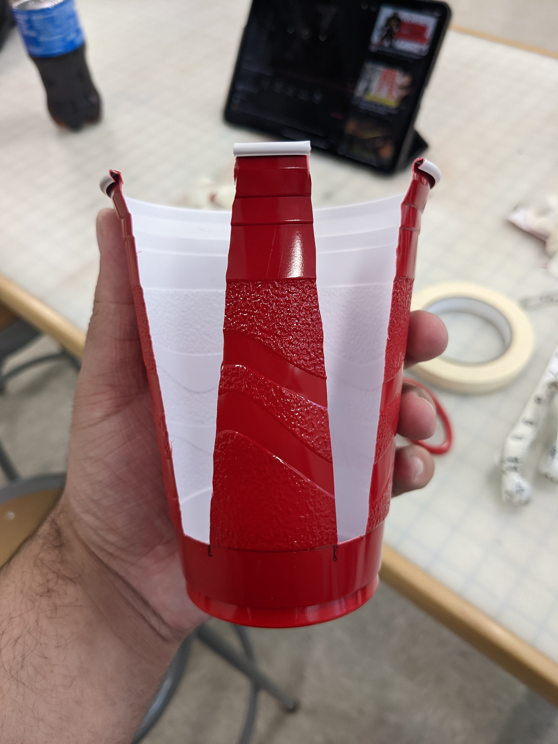
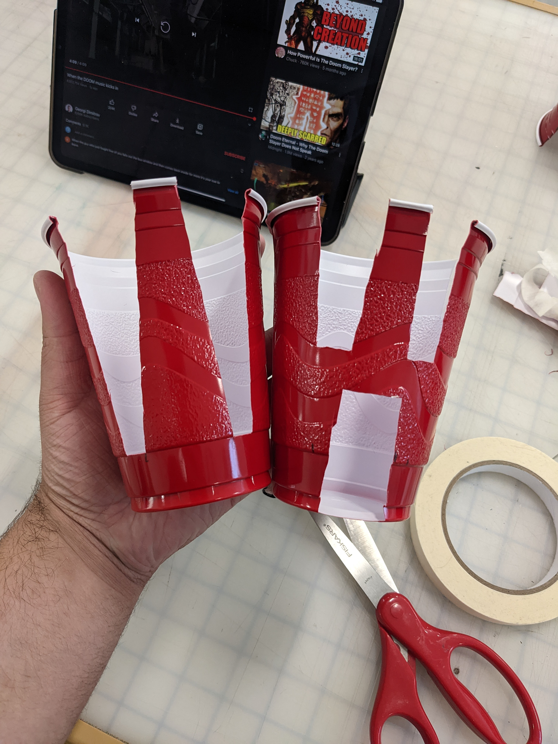
Here is a snippet of my work process in making the cup letters. First, I try to mark accurate measurements from my tape measurer with a sharpie. I then use masking tape as a guide to make sure that I didn't cut much more than what I needed to. After that, I use a precision knife to cut and clean up rough edges. The tape is removed and the black marks made are washed off before they're considered complete. The cups I made so far turned out really well with the exception of the letter "W". I had a few unsatisfying results before completing it the third time.
PHOTOGRAPHS
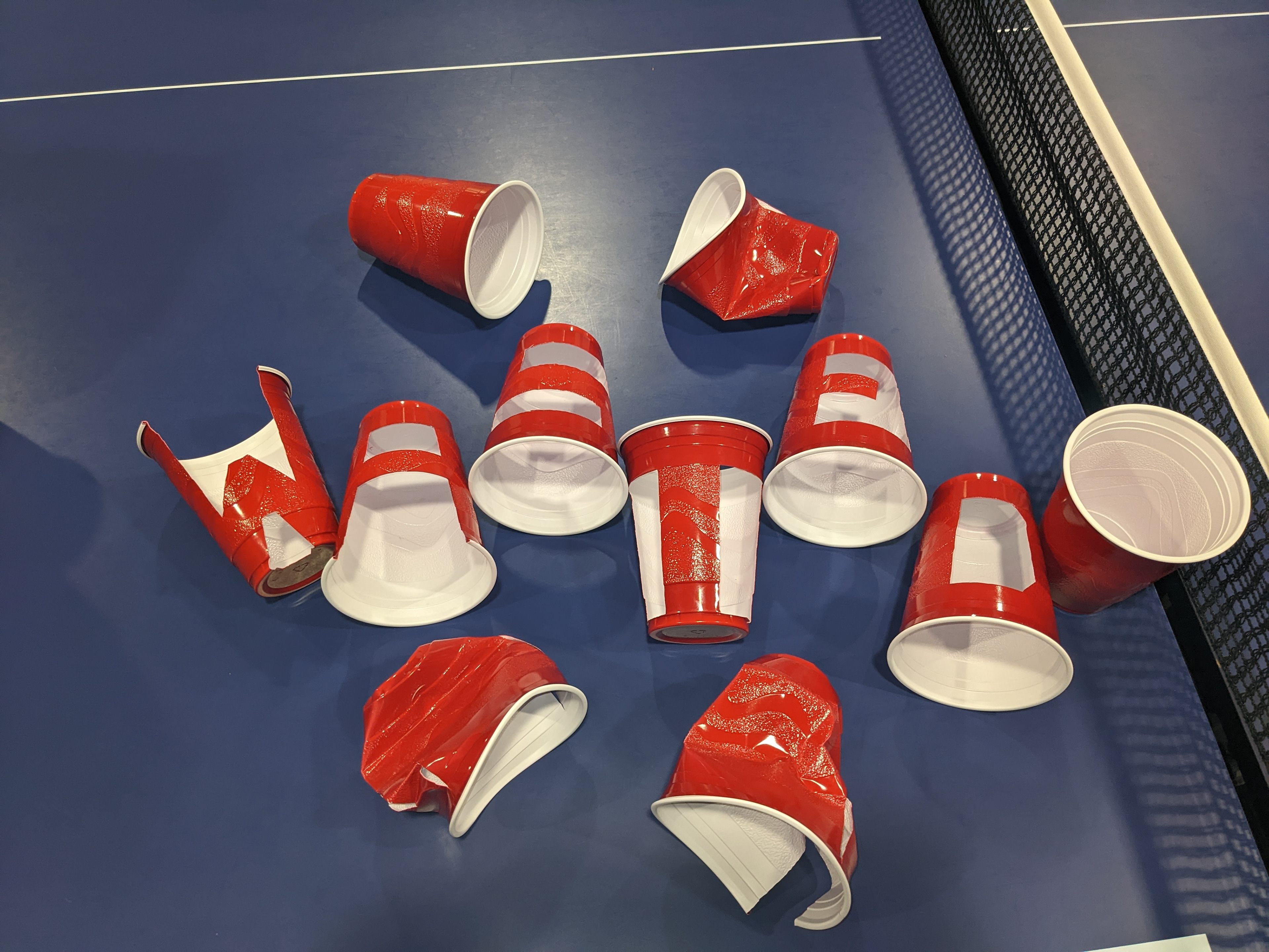
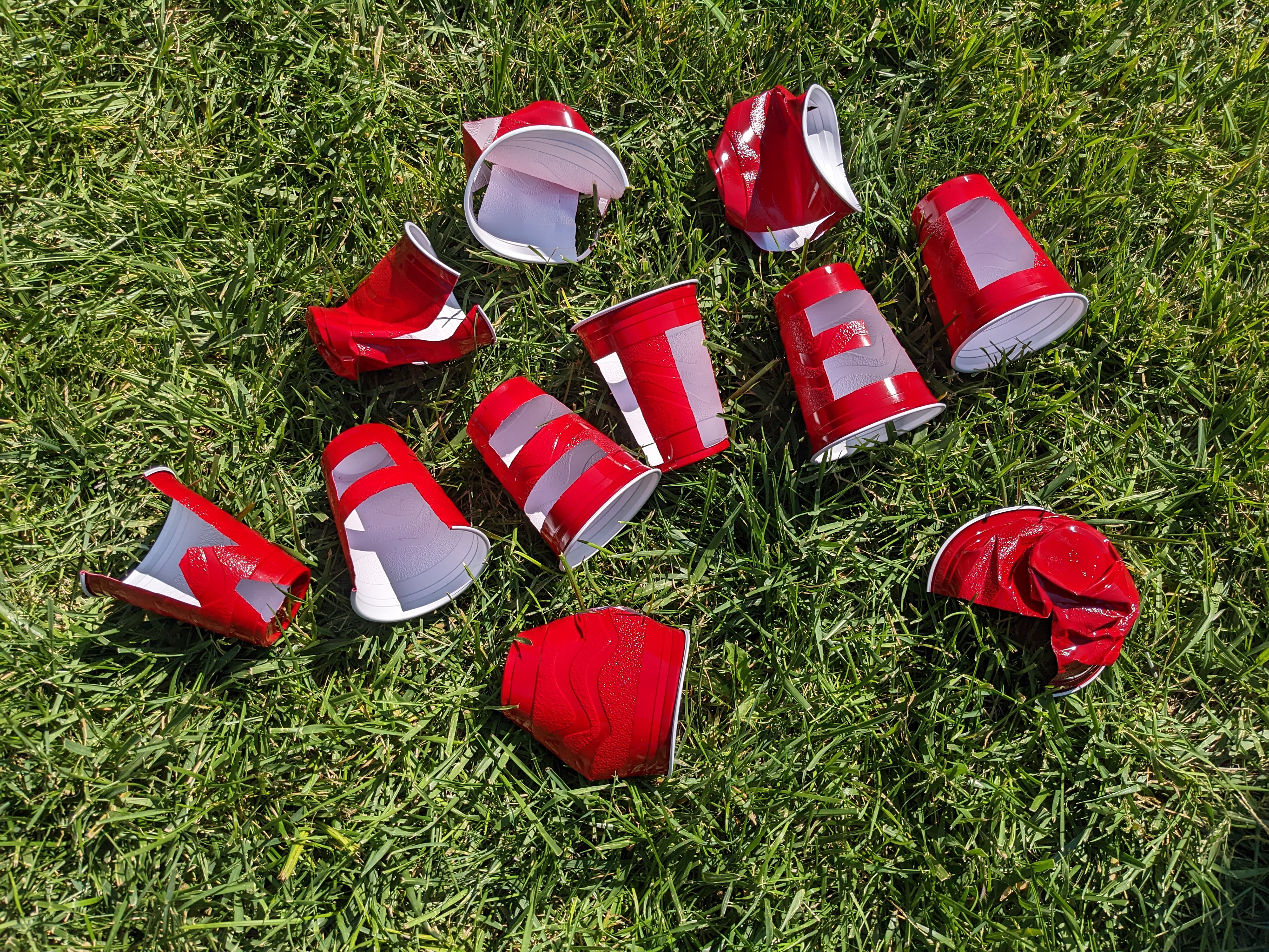

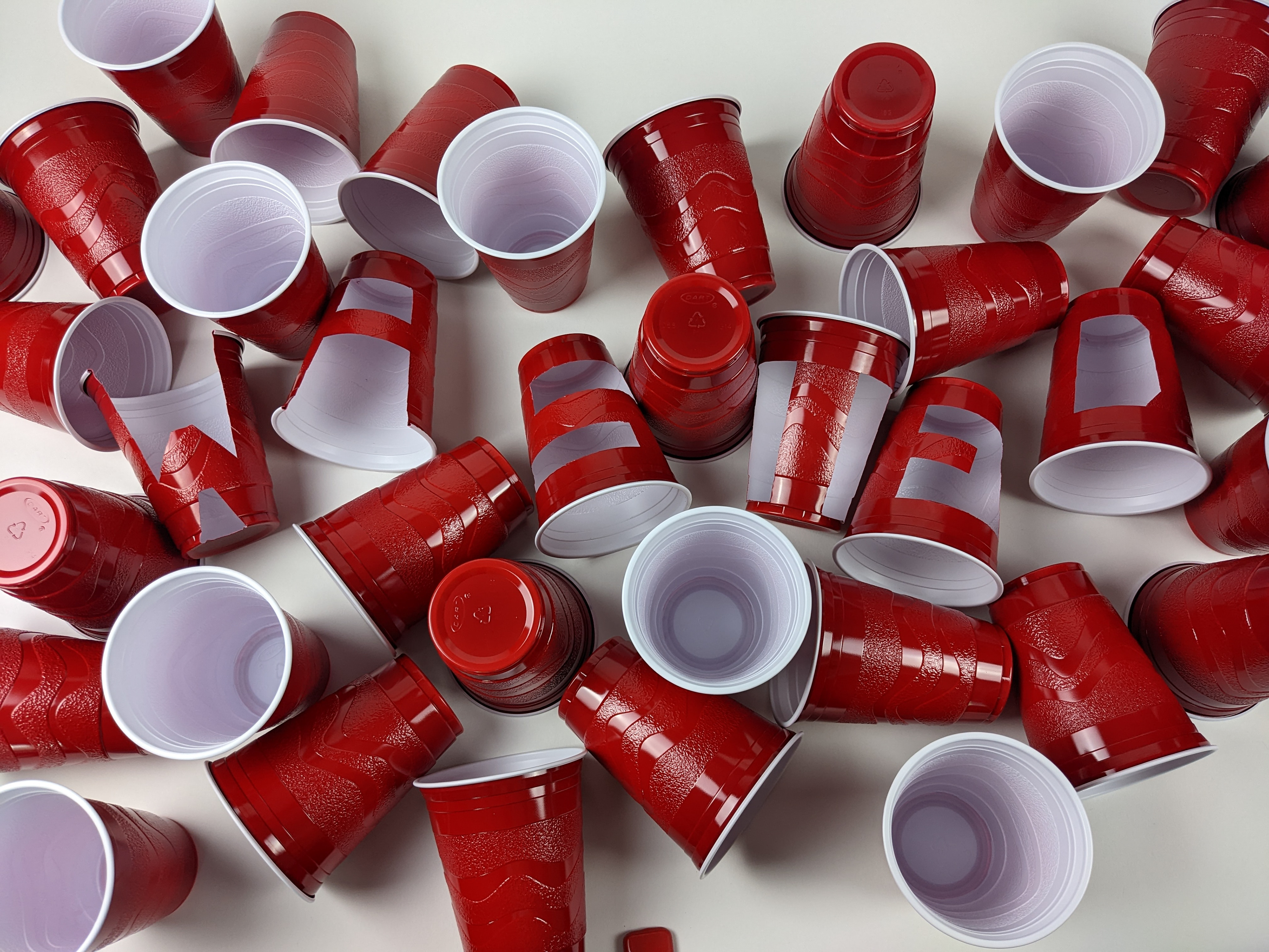

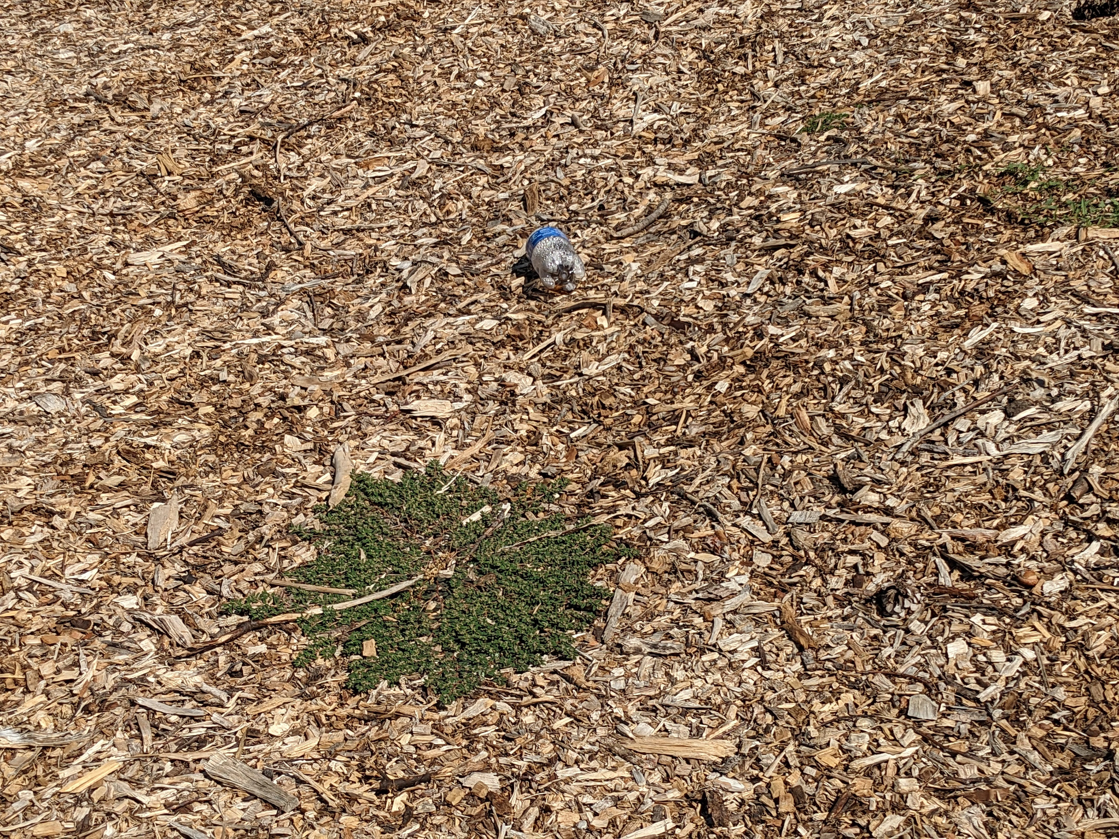
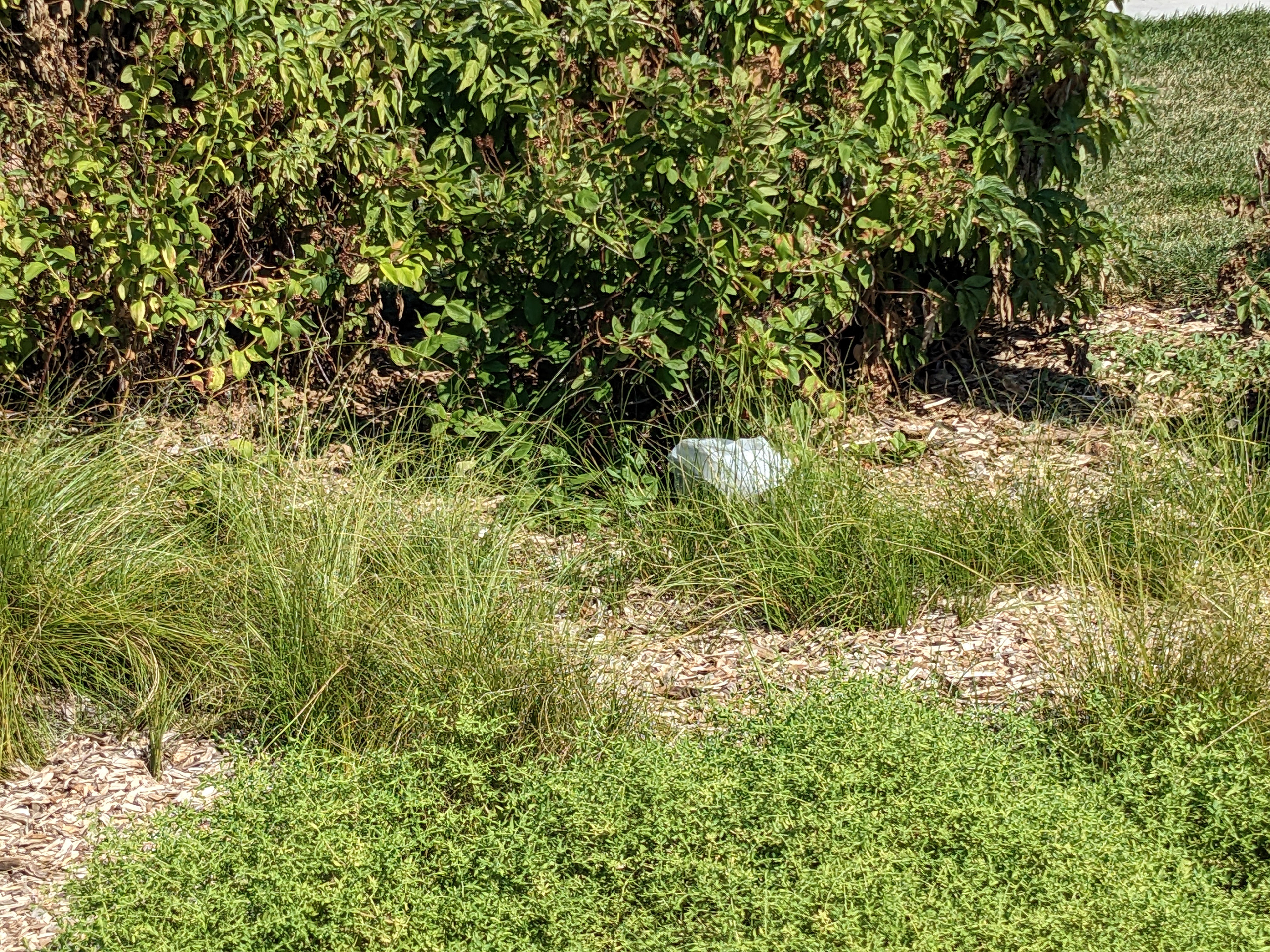
After I was done making the letterforms, I took them out to the real world and placed them in various locations that seemed to fit with what I had in mind. I spelled out "WASTED" since these cups are often associated with discarded plastic and being drunk. As you can see, I placed them in five different locations to see how well it works as well as placing props to help out with the messaging.
PHOTOGRAPHS

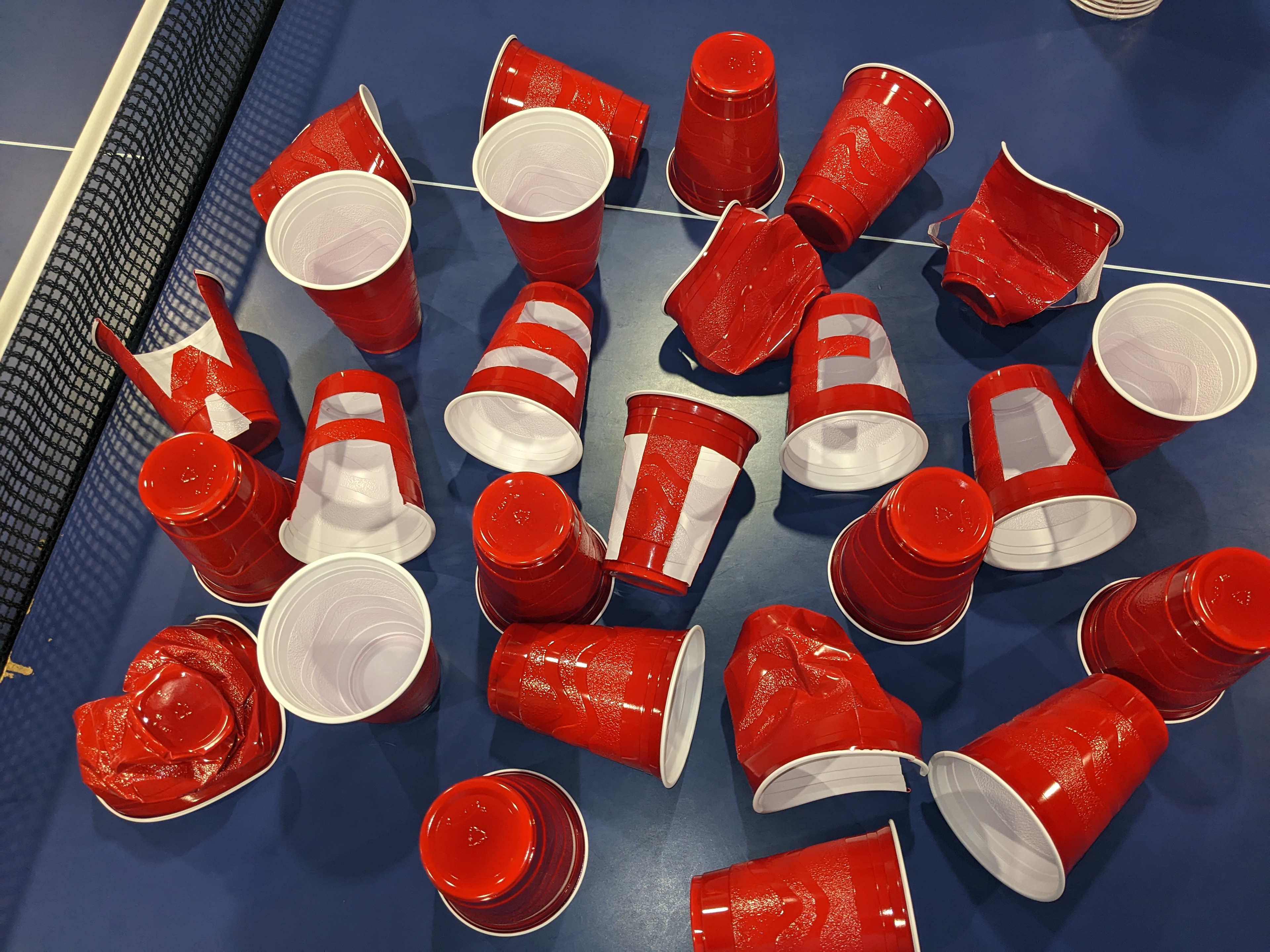

These were my top three picks out of the many pictures that I took. While I would have liked to pick only one, I felt that these letterforms were suited in multiple instances as opposed to just one. Would I like to do more with these letterforms? Yes, I would. Will I? Only time will tell.
